Exploring the Design of Instagram

Since 2010, Instagram has captured tens of billions of moments.
It has been the subject of countless human behavioral studies, and with over one billion MAU, a critical part of society’s social media landscape.
Due to its massive reach, the addition or pruning of features on Instagram often create large shifts in the way people consume the app’s content.
Programs used:
- Figma
- Adobe Photoshop CC 2019
- Adobe Illustrator CC 2019
- Lottie / Lottie Files / Lottieflow
- Font Awesome / Freepik / Unsplash
DISCLAIMER: No copyright infringement intended; all applicable images belong to their rightful owners.
This is a design case study.
If you'd like to see this prototype in action, send me a message from your work domain. This is a 100% interactive prototype, achieved natively in Figma.
The Feedback
Historically, Instagram’s design has been very simple and easy-to-use.
Changes over the last several design cycles have integrated both features and buttons in less-than-optimal positions, putting that into question.
There’s a lot of things happening at once, and at times, it feels like noise.
An update in October 2019 removing other user Activity tracking stoked the already-lit flame of users feeling unsure of the direction the app was moving in. Less than a year later in May 2020, the same Activity tab was completely moved in an, subsequently replaced with a Shop tab.
Even with recent changes made in November 2020, the moves Instagram has made leave users puzzled at times.
Several improvements could be made, and they’re more subtle than you may think.
The Situation
Instagram is not dying by any stretch of the imagination.
In fact, it’s growing at the fastest rate it ever has since being acquired by Facebook in 2012. As of last year, they raked in nearly $20 billion revenue; their plates are not going empty in the foreseeable future.
That doesn’t make them immune to improvement, though.
People use Instagram primarily for photography blogging, or connecting with friends and family. The core of the platform’s purpose for nearly a decade.
However, with the advent of TikTok and full-cycle in-app shopping becoming more prevalent across all social media, the roots have been somewhat forgotten.
This redesign is an attempt to find those roots again, while still staying fresh.
The problems that stood out to me as a daily user:
- Reels (2020) feels like a cheap integration of TikTok on Instagram
- Shop (2020) feels unfinished, and leaves something to be desired
- Stories (2016) never really improved past subtle UI and filters
- UX could be tightened
The Solution
My approach was to redirect certain flows (literally the flow your thumb and fingers) while navigating Instagram to make it feel more comfortable.
Reposition buttons for more friendly UX, integrate consistently-requested features, and clean up loose ends within the current design.
- Make Reels feel like a proper sector of Instagram, not some add-on
- Increase the depth of Shop and make it easier on the eyes
- Stories are often personal; increase how immersive they are with scale
- Tighten up placement of button-pressing and retrieve “old Instagram” feeling
- Subtle changes to the way various frames scroll, interact, or appear
- Refine the above and create a new feeling for Instagram
The Thumb
The entire approach to this redesign is based around a right-handed user’s thumb. It sounds silly, but the data shows a high percentage of app consumption is due to a person’s thumb.
So it begs the question — why has Instagram shifted high-usage buttons into strange places, such as the current Collection integration? It now takes 3 separate taps to navigate to your bookmarked posts, a large part of Instagram’s roots has now taken a back seat in favor of Shops.
Why?
As a day-one user of the platform, I felt this was a pocket for improvement, and decided to try my hand at it.
Several sections, interactions, etc., of the app were left out as I saw no change needed.
The Research
An interesting aspect about Instagram’s ecosystem and place within social media is the way it acts as a conduit of expression. More direct than Facebook, more succinct than YouTube, and more visual than Twitter.
Due to this, Instagram has become a go-to within formal studies which relate to motives, representation, expression, intention, and other human traits when pertaining to social media consumption.
With the average user consumption time teetering at half an hour per day, immersion is important; reprioritization was necessary to achieve a friendlier experience.
One approach is digging into the Stories integration. Over 500 million stories are interacted with per day, in comparison to 130 million shopping posts per month. Making Shops a mainstay on the default navigation feels intrusive, and results in lower engagement; a mere 0.96% engagement rate is the average for business accounts.
Out of 100 users polled, a mixed bag of 18–55 daily users, for this case study:
- 66 think Instagram design could be improved
- 72 prefer an older design to the current one
- 61 think Instagram should be more simple
- 91 would not be sad if Reels was removed permanently
- 39 use Shops daily and support its integration
- 19 are perfectly happy with Instagram as-is and have no complaints
We can gather from this informal poll that users want change, they’re not sure exactly how or what to improve, but they’d like a strong focus on photography opposed to Reels, Shops, or other features which complicate the app.
With only a third sitting with no complaints whatsoever, perhaps it’s worth a shot at improvement?
Maybe we can extract some inspo from other large photography-focused websites:
A New Look
The gradient was a bold move, and although the flat approach was nice, I feel like it took away from the power of what the logo could have been.
Previous iterations of Instagram’s logo were more familiar and felt more like what Instagram “should” be — more cozy, perhaps?
However, a decade after the brown logo we all knew and loved was put to rest, and half a decade since the gradient shift, it’s time for a clean change.
We all know Twitch tried this as well.
This didn’t make it…

The most ironic part about this is that I went in wanting to be as minimal as possible, and months later, the exact same idea pops up in this Dribbble post. The exact same thing Levi shaded me for. He was right though, it has no character.
Who’s Levi?
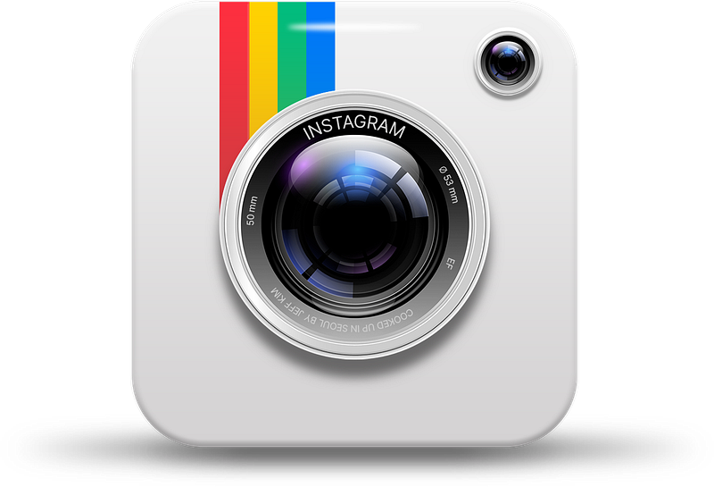
Strangely though, not a single attempt at going back to the roots of the iconic vintage camera design.
I used Facebook’s hyper blue, and played with the circle widths for days on end trying to strike a perfect balance, and I was almost going to rock this in the final case study…
Then I thought you know what? Go out of the box, everyone’s doing flat design when it comes to logos.
Go back to icons that were hot when Windows Aero was the king of design, listen to yourself. Go against the grain, why not? Stitch together the best parts and mesh it with modern.
So, I did.
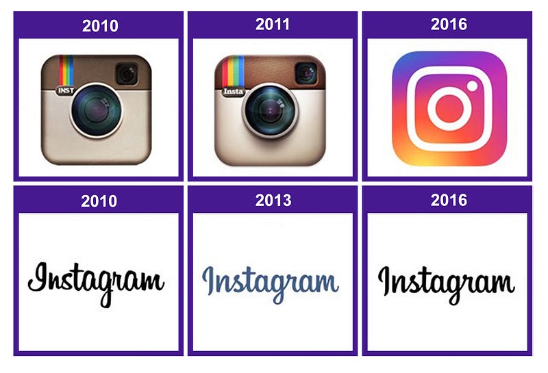
Like many users, when I think of Instagram, I think of that 2011 logo, and that was the feeling that had to be captured. That's not to discount the design genius Ian Spalter's redesign.
Keep the stripes, keep the shape, keep the idea, and above everything else, keep it simple — just give it a facelift.
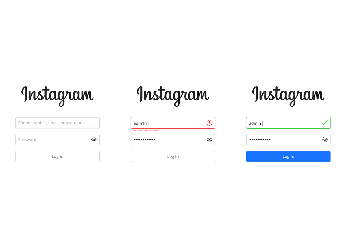
Onboarding
The onboarding for Instagram had room for improvement, and color switches indicating success or failure add a bit to the experience. A small symbol to assist doesn’t hurt, either, even if less is more.
Intro Flow
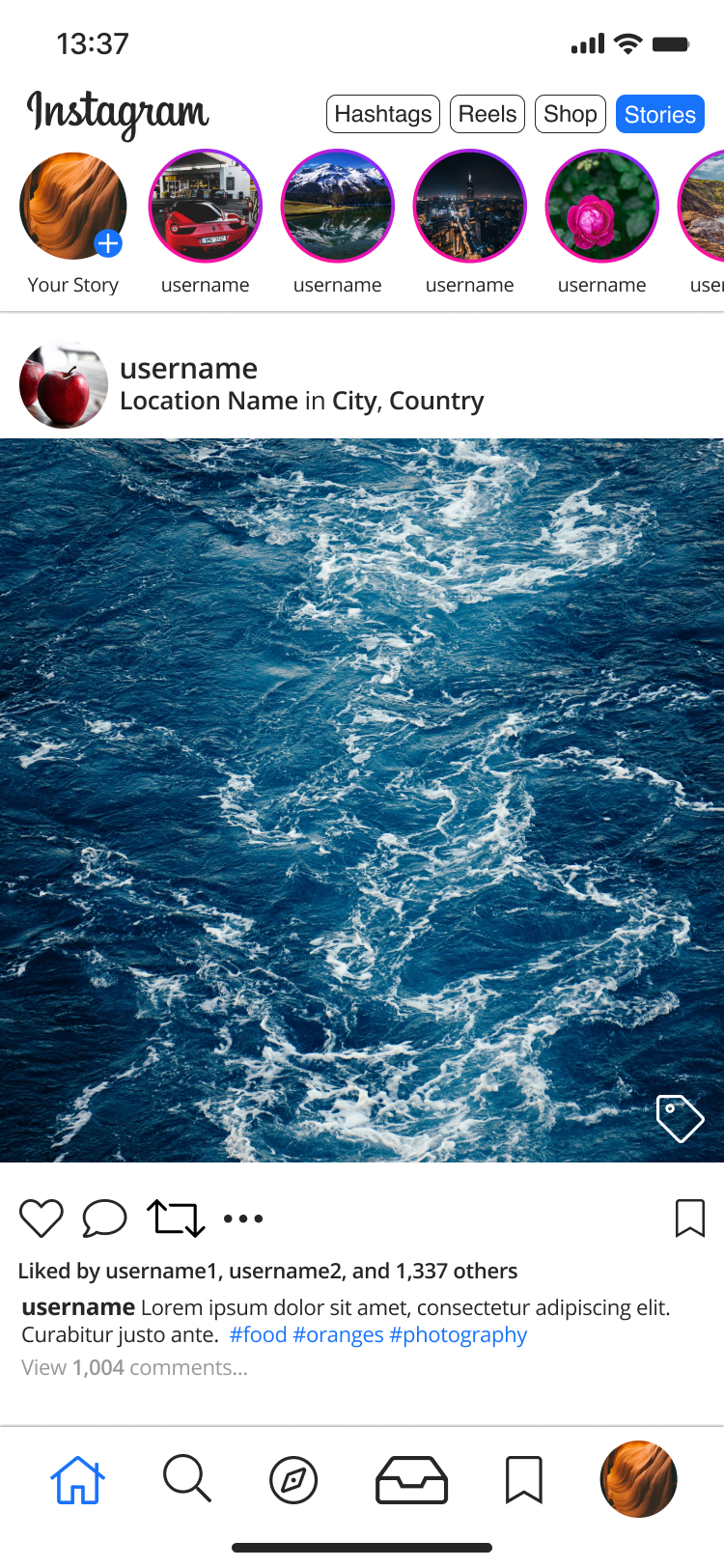
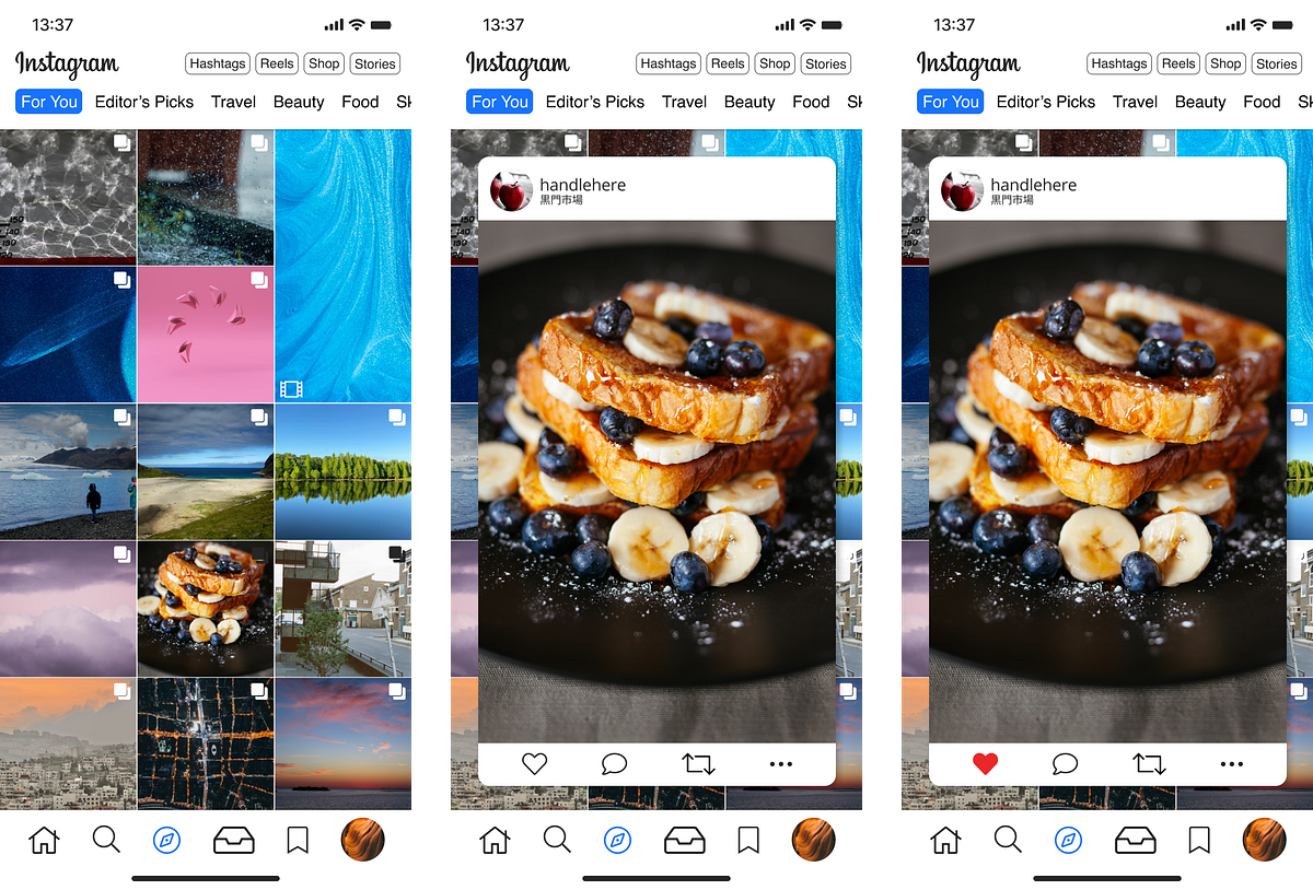
You’ll see a few changes right away with my version. The 3-dot context menu has been moved to a more thumb-friendly position, and a repost button (finally!) has been put in.
You may notice the current gradient has been kept on the stories; I felt like the gradient was a great approach and aesthetic, but didn’t feel like it worked well inside of the actual logo itself.
Instead, I tried to integrate it a bit more throughout, in-app, to have the colors shine. After all, Instagram is all about photos, bright colors, emotions, and all that jazz which comes along with it.
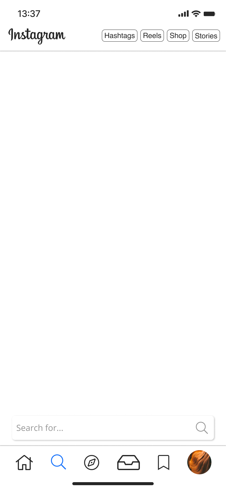
You’ll also notice the Explore and Direct Message menu is on the bottom primary navigation bar.
I felt like Shops was intrusive on the current iteration, and wanted to dial that back, but bolster its integration — we’ll touch on that later.
Same with Reels; I don’t like how Reels became a central part of Instagram. Some would argue it is an evolution that was necessary with the advent of TikTok. That’s correct, however, the way it was integrated could be friendlier.
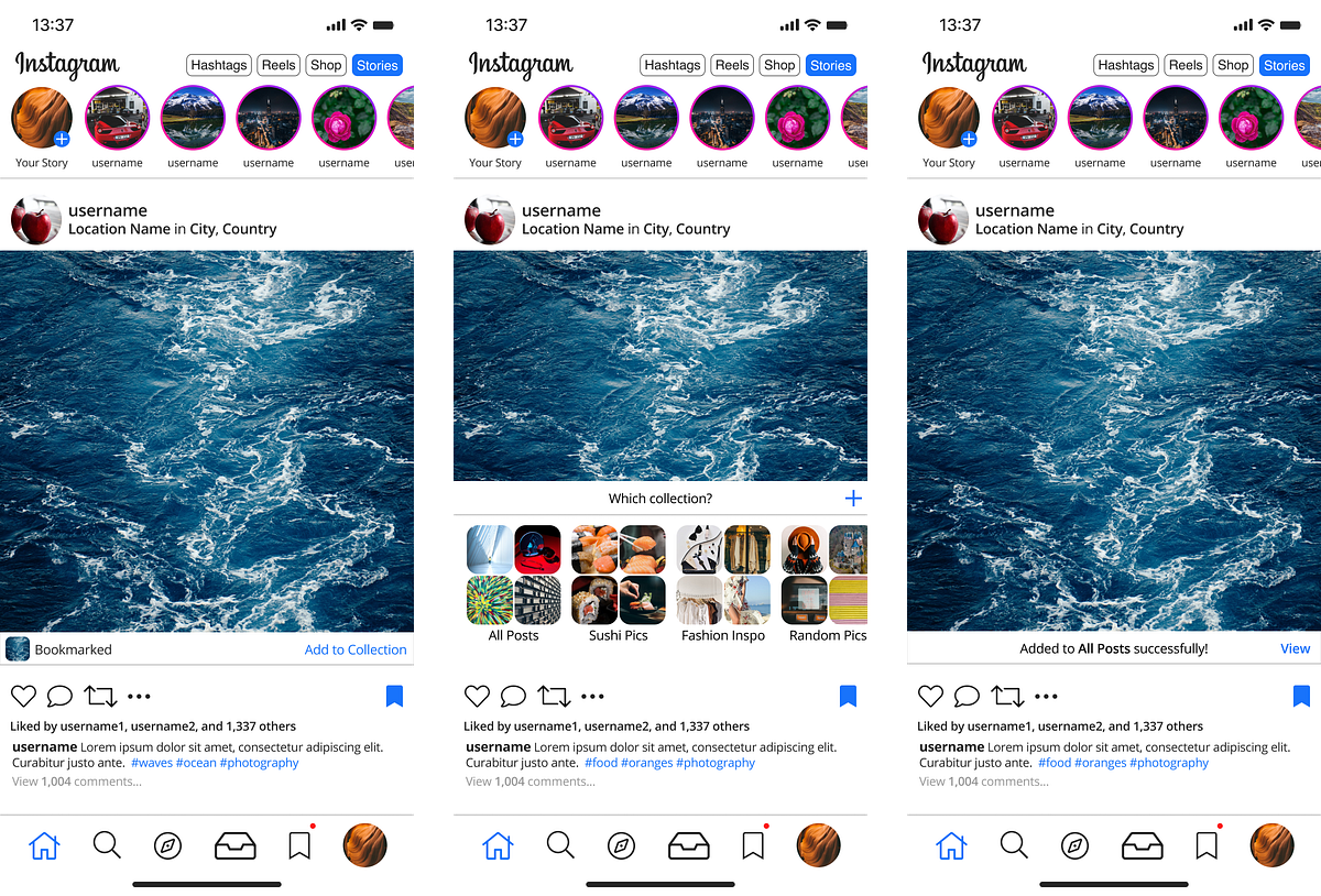
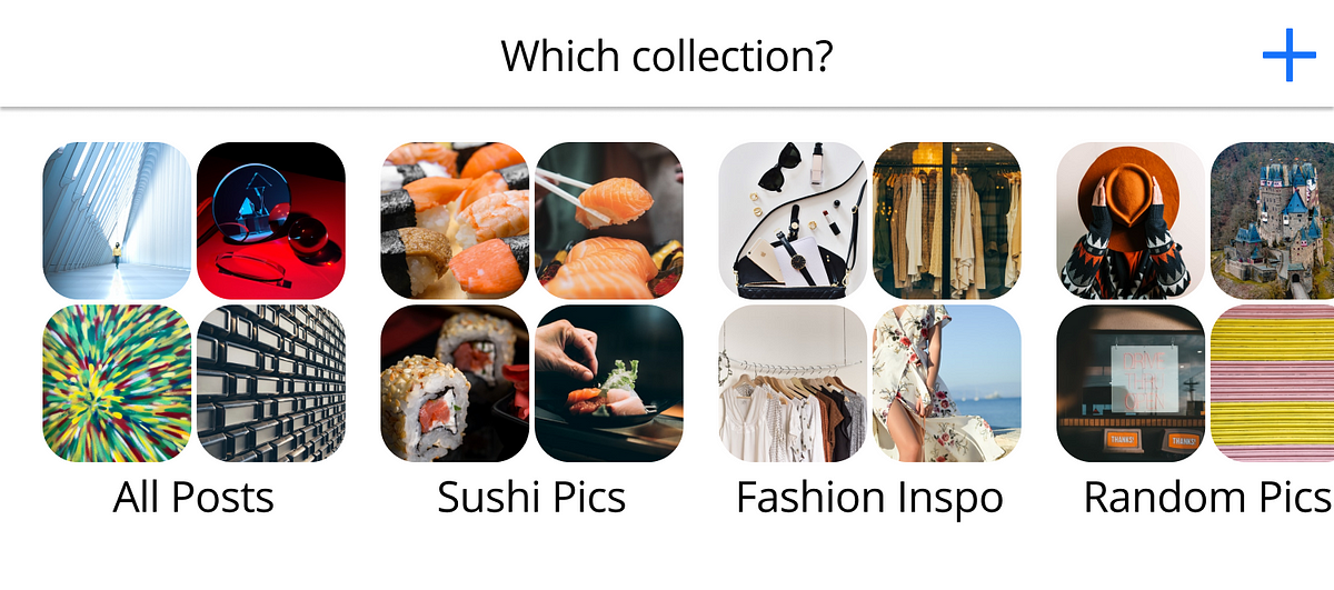
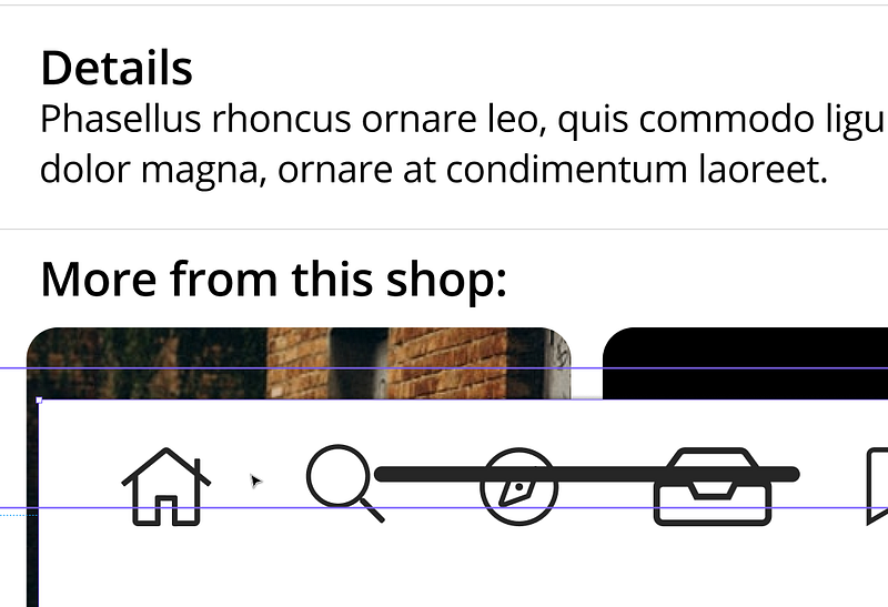
Below, the flow for adding a post to a Collection, with a closer look at the Collection design.
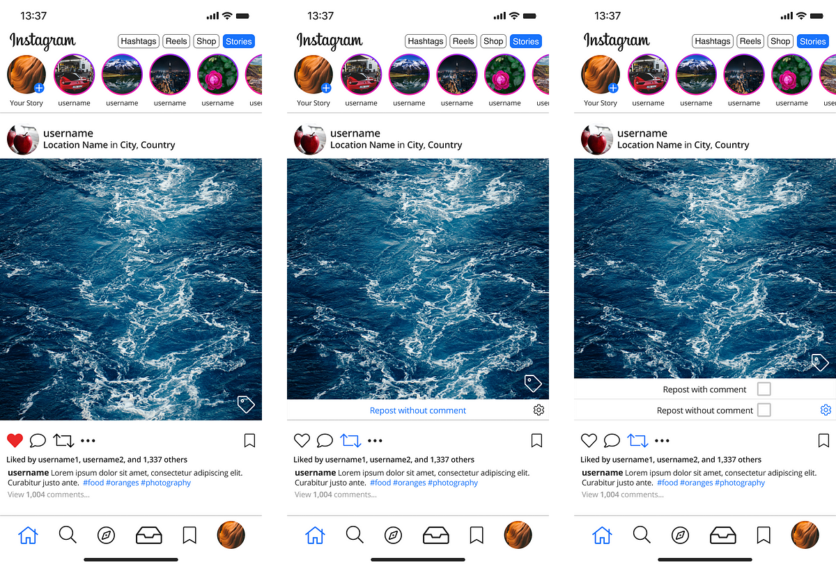
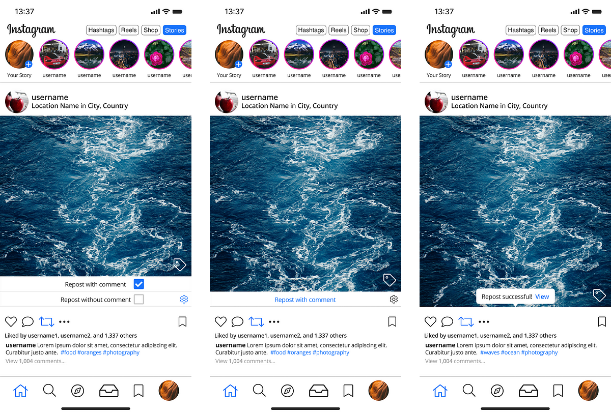
Repost
It’s not real, but it exists in my version. Let’s hope they put it in soon enough.
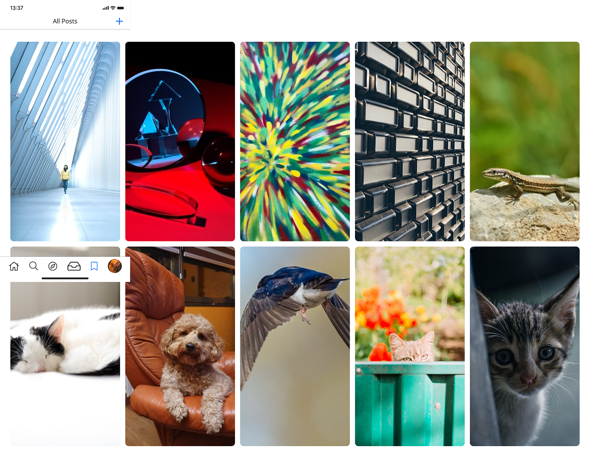
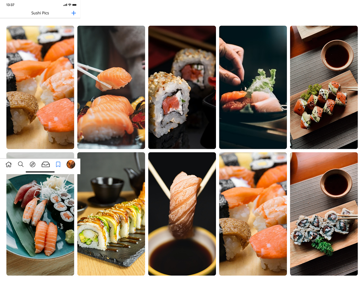
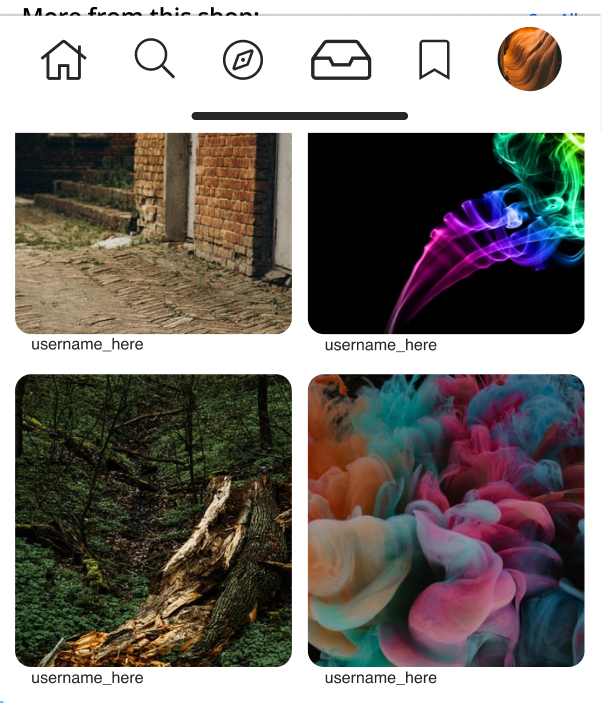
Collection
We all have a collection or two; some of us more than others. Curation is a large part of Instagram’s aesthetic, and has served as a large movement after the fall of Tumblr.
I wanted to bolster it a bit and show it more love.
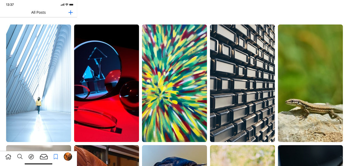
The difficult part about this was that I wanted to use Collection for both the series of collections a user can have, as well as their Bookmarks section, but when I prototyped that, it just didn’t flow correctly.
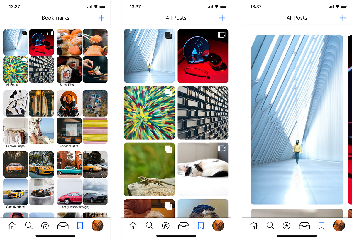
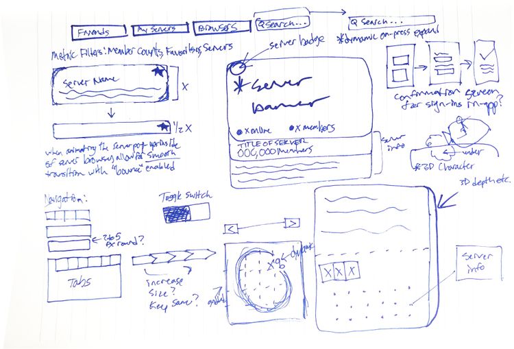
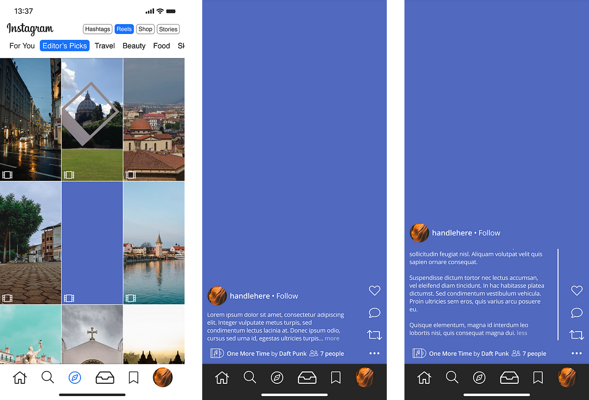
A quick “behind-the-scenes” look at the Figma frame for this one, what I’m trying to show here is that on-swipe, the user is able to navigate left and right; this would be contested with a scroll-lock of sorts to prevent vertical scrolling accidentally.
Once a photo horizontally-locks into place, the user is able to scroll vertically (or continue horizontally) as they wish.
Back to the point of curation, numerous studies pertaining to the psychological behavior, benefits, and motivation behind such on Instagram.
One of the most interesting papers I came across was via Bente Jensen at Aalborg University titled Instagram in the Photo Archives Curation, Participation, and Documentation through Social Media.
Seemingly more interesting than the paper’s contents itself is the year this was published — 2014; far before many of the famous curators (think Hidden NY as a textbook example) were even on the platform.
Instagram is in some ways the new Flickr. The photo sharing platform Flickr from 2004 was taken to heart by many cultural heritage institutions. Flickr Commons has been a way to meet the cultural institutions and to introduce an interactive platform for digital exhibitions of archival material quote: “The key goal of The Commons is to share hidden treasures from the world’s public photography archives”.
Could not have hit the nail on the head more perfectly. Seven years after this study was published, this rings true more than ever.
You could argue curation is the central nervous system of Instagram itself, albeit feeling like only a small sub-sect of the larger trends. It has been embedded within the app’s fabric since inception, only presenting itself more prominently within the last half-decade due to various phenomena online.
Tags
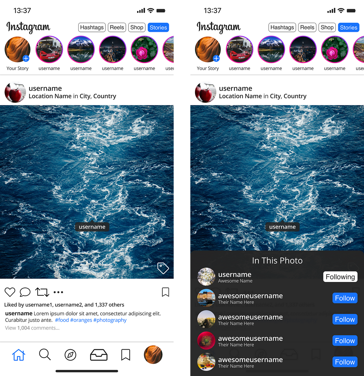
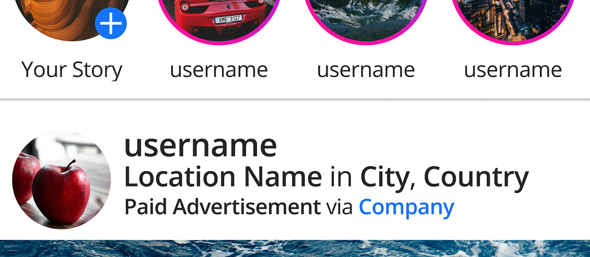
The context menu which appeared when a user presses a tag within a photo felt like it could use a quick tightening, so I went ahead and made that menu a bit more friendly.
Currently, there’s a lot of large padding that feels unnecessary around the Follow action as well as the username tag itself, although it’s meant to balance out the negative space for both cases.
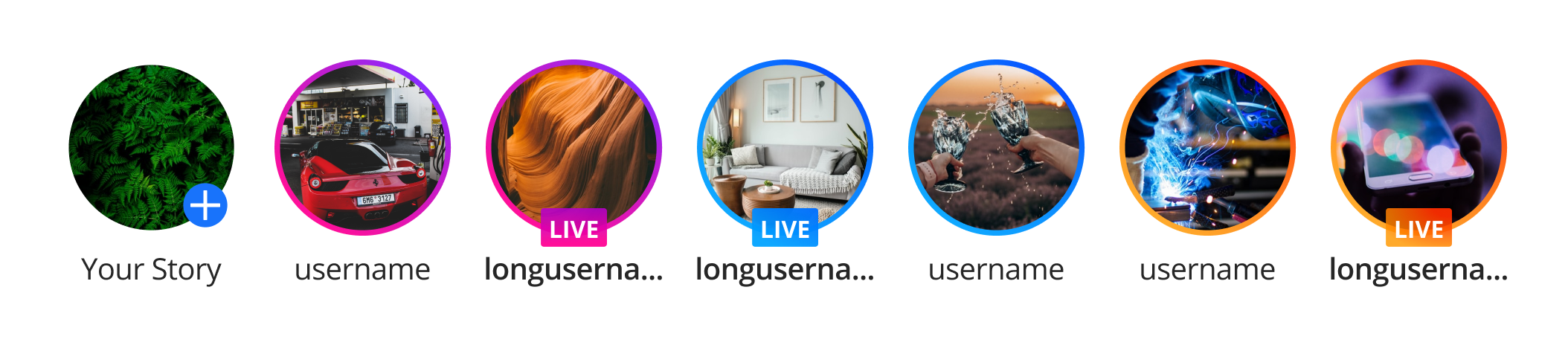
In the case of long usernames (and profile nicknames), I found this to be a pain point, and wanted to remedy it.
Although my use of negative space is no better, I felt like at least the color scheme switch up was cool enough to warrant including this part.
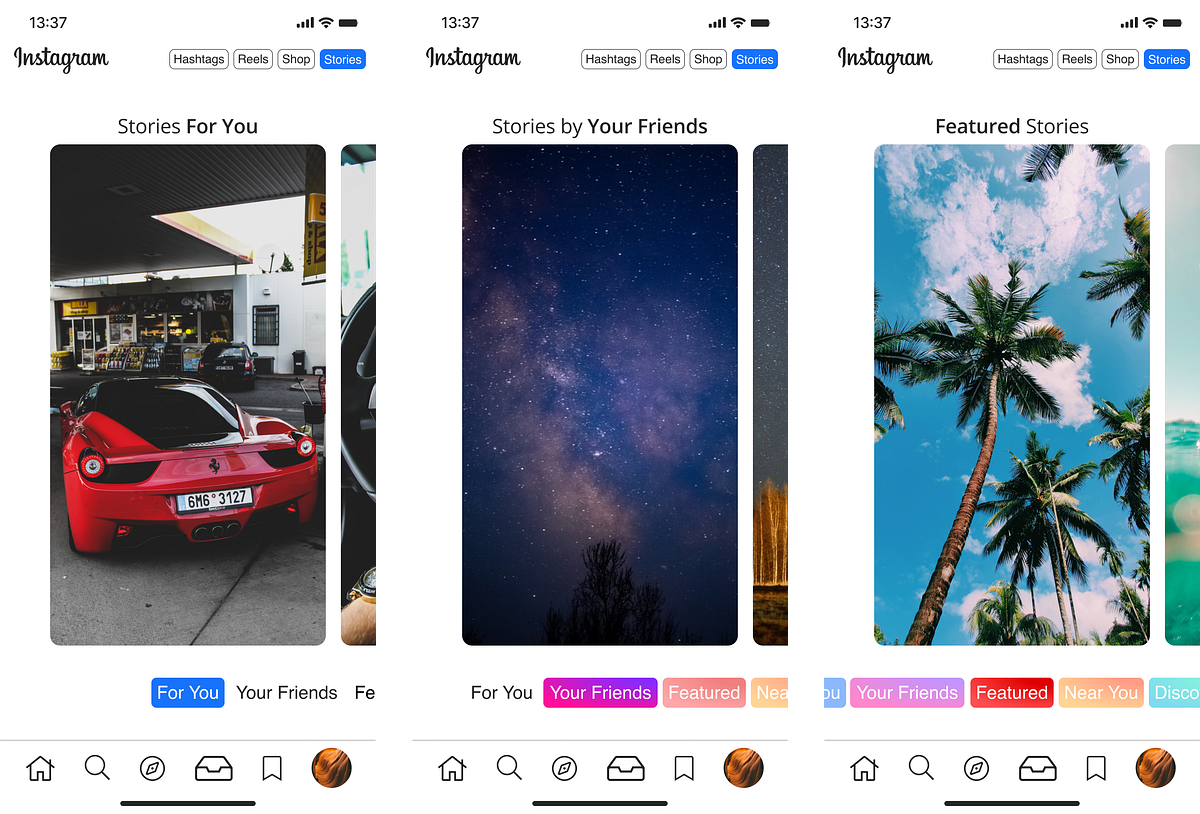
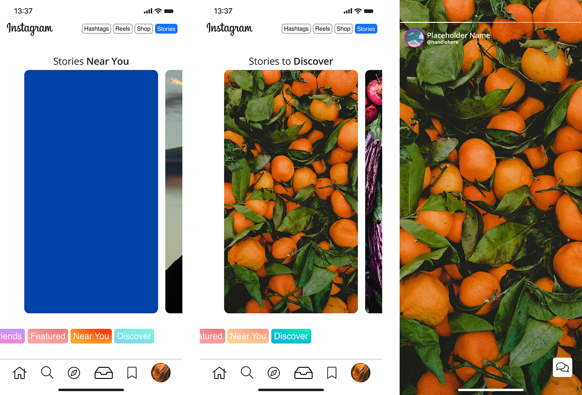
Stories
Launched half a decade ago in August 2016, but only able to make drafts as of yesterday, mid-July 2021, Stories serves as a way for quick, ephemeral content to be dispersed to followers in a fun and approachable way.
Interaction was added later, such as polling, tagging, sliders, and more.
Taking the idea of expanding upon gradients throughout, I tried my hand at what various types of Stories could look like.
Era of Ephemerality
Stories has proven to be one of the most effective examples of ephemeral journalism in the world, something which we don’t necessarily think about when we see friends throwing back cold ones or posting funny snippets of their pet spinning around.
Take studies such as this, analyzing the effect, impact, and paradigm shift we saw with Snapchat and the aftershock it had on journalism as a whole in the mainstream and otherwise. It may sound like a reach, but human behavior has very interesting results because of how these sorts of social media facets operate.
Facts are, people will not read long-form unless it’s directly relative to their range of interests, or is so incredibly strange and outlandish that it reels them in. A long-form on how cabbage is grown? No chance.
Short-form content is king wherever you look, and it’s evident. The very structure of social media platforms like Instagram, TikTok, Snapchat, Twitter, and others favor, on a foundational level, this movement of short-lived, abundant, concise content.
It is a transitory state which is not new, but has come into its own form. The idea dates back since the early days of YouTube with news recaps, if we want to keep it to relative platforms.
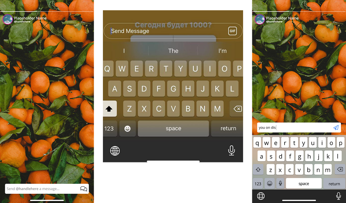
All of that to say, my approach to these stories is to make the user feel more immersed in each.
When browsing a Story on Instagram currently, it just feels like viewing a page out of someone’s book — that’s fine, but I want to have the feeling of holding that book while I’m viewing it.
Full-screen reveals and a more flowy interaction achieves exactly that.

Immersion and the Importance of Telepresence
Consider the nature of ephemerality. Such communications, by proxy, imply that other aspects—such as immersion, telepresence, and relativity to user’s own interests — are critical for the experience of Instagram as a whole.
I tried my best to keep this in mind when designing Stories especially, as well as this study.
This isn’t a psychology thesis, but there are a few things I can see playing a large role in UX when it comes to Instagram, which really aren’t given attention unless you dig beneath the surface:
- transportation theory
- telepresence
- for Stories especially (maybe Reels?), dual processing theory
By extension, this is one of the main reasons why Instagram has one of the longest stay times. Keep in mind that although TikTok is substantially larger in a % overview, TikTok is all video. Instagram’s very core is photography. That’s a huge difference.
Explore
Honestly, what would Instagram be without the Explore page? Unless you knew exactly the handle or hashtag to look up… you’d be out of luck in the early days. In fact, until 2012, it wasn’t even in the UI.
The Explore page used to be terribly inaccurate when it came to matching user interest; now? Give it a few days on a fresh account, and it’ll fit like a glove.
WIRED did a great piece on why the Explore page is such a critical part of the app.
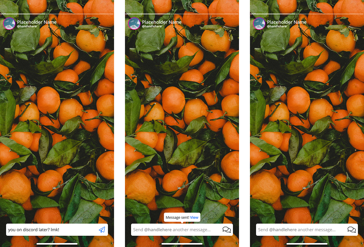
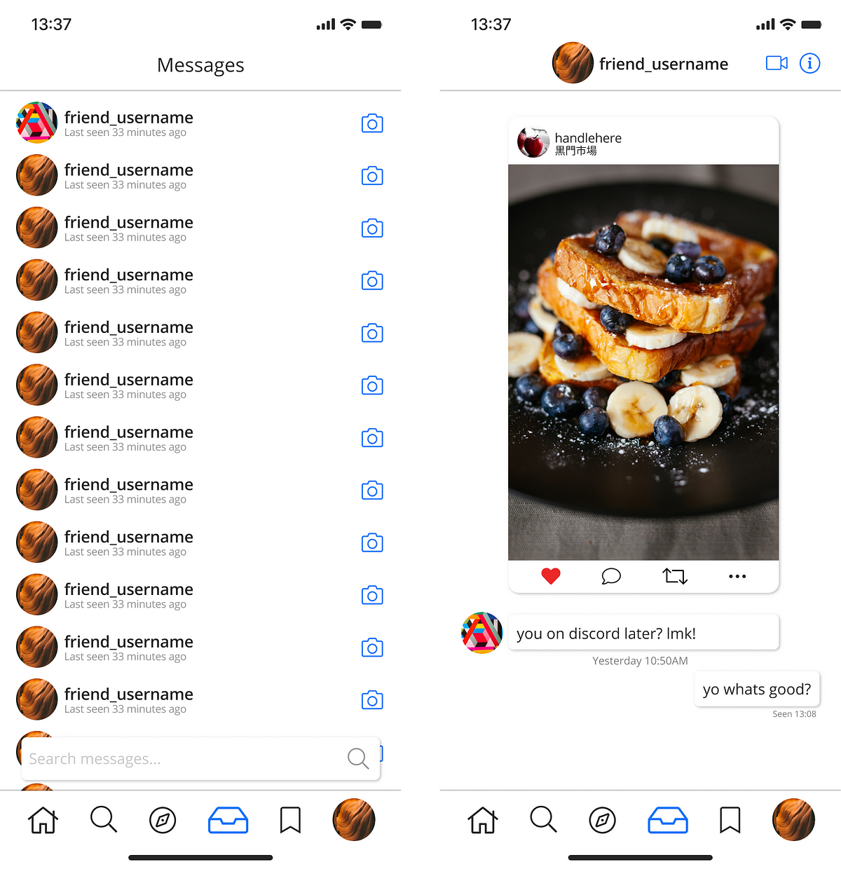
Messages
Whether it’s emulating a thirst trap or used for haggling rep shoes you think are real, ever since they opened, Instagram DMs have become a world of their own.
Shops and Reels: The Invasion
Ok, that’s taking it a bit far, but I do feel like both Shops and Reels were presented in a way on Instagram that felt intrusive to UX.
Are they cool? Yeah.
Could they have been introduced in a better way? 100%.
I feel like Instagram really focused on Reels and pushed it hard with the Year of TikTok, and felt like they were threatened in some way, when in reality, Instagram has always had its own unique lane to prosper in.
As for Shops, I feel like especially with Facebook Market, and WhatsApp Business, it could have been a hybrid or something.
Why does one single company need all these iterations?
What is the advantage?
Make them interconnect and benefit small business owners in different ways on each platform instead of fragmenting a single concept.
I digress; I went in and redesigned ‘em.
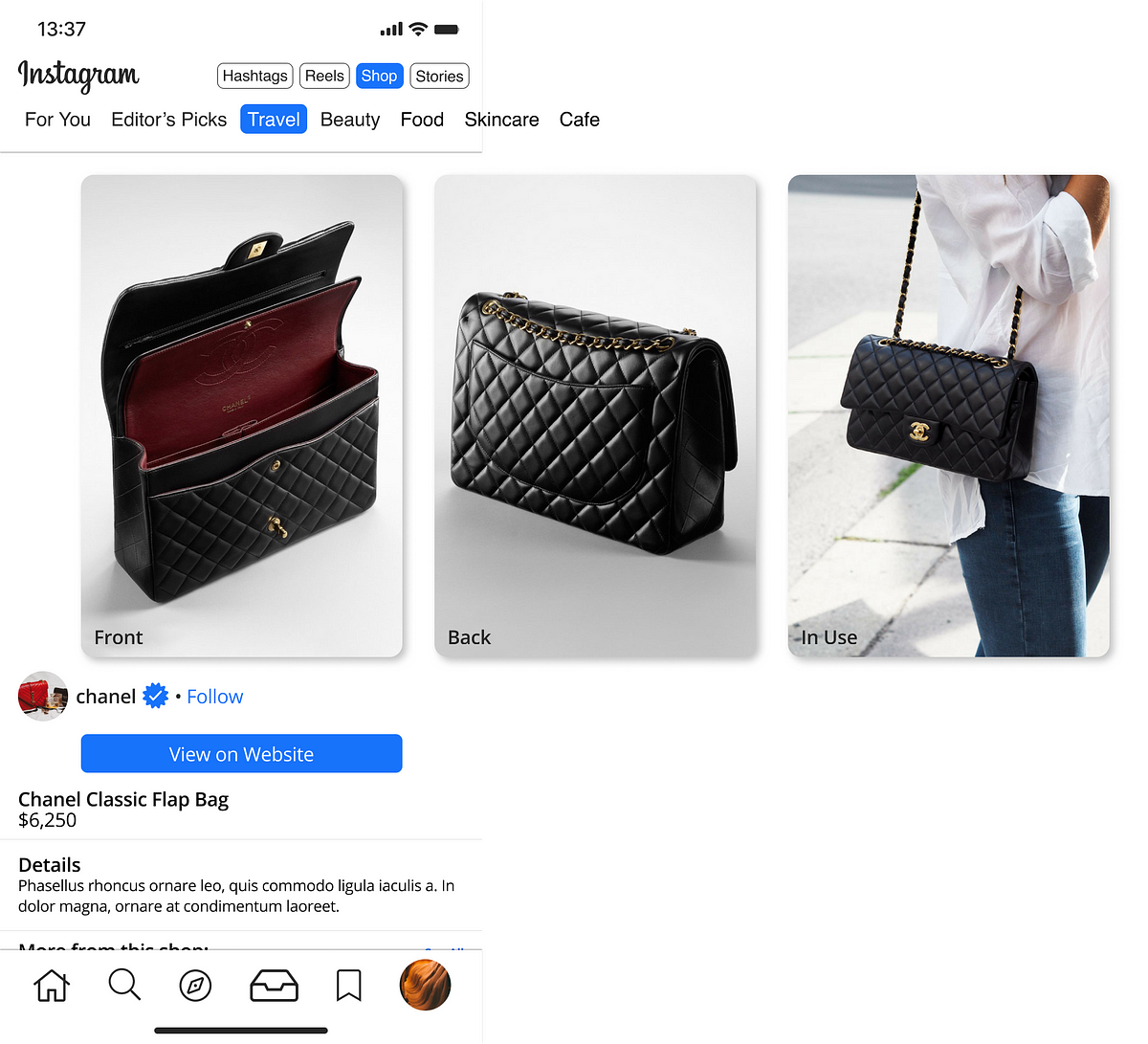
Shops
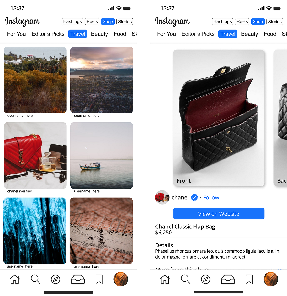
I opted to use (verified) as a placeholder… couldn’t justify using the badge on that menu, not really sure what’d work… lots of impostors with alt symbols, so it’s something that’d have to be A/B tested in-app, in reality — maybe a dedicated section of verified sellers/brands?
Reels
Miscellaneous Stuff and Rejects
These are minor things and inspiration that I used for this case study. Also, rejected designs that got shit on when I peer-checked them with people that are Instagram addicts, who know literally nothing about UI or UX (the best people to test such things on).
Sometimes being too honest is good, and makes you double check your own work.
Primarily, a lot of Discord requests from friends to send me their UI on an iPhone, because I don’t own an Apple device to check.
The Random Stuff
This inspo board was not that large compared to my Discord/Spotify integration, and I think the reason being is I’ve used Instagram since day one and know exactly where certain features are, or where I wanted them to go prior to even started this case study.
Had I not known Instagram like the back of my hand or it was new territory, I think this would have been much larger. In the case of the Discord/Spotify integration, the idea of implementing a full-feature music platform within an existing platform and using it as a bridge between two behemoth platforms was daunting and required substantially more research.
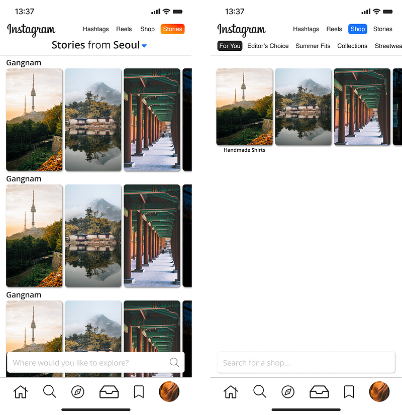
Minimal Search
Sponsored Post
The Bare Bones of Everything
This may be released as a public library for reference on Figma at a later date.
Everything you see in the picture below is made from scratch with two exceptions: photos via Unsplash, and vector icons via FontAwesome. The iOS keyboard is a modified template via Denis Rojčyk. I wanted to prove to myself that I could create Instagram’s design from scratch, even if it did take me forever.
So, with a few hundred hours of work over the course of 3 months, I went ahead and made this sort of pseudo-library for each and every part which I re-used several times. Some of them rejects, others just not really used because of the direction stuff took. This is about half of the complete library.
These are also fragmented to fit like puzzle pieces — for example, the 3x3 main feed grid has full Prototype integration and capability on the highlighted orange square, and can be inter-connected with any other such ‘node’ that I’ve created.
I did this because I feel that even if you knock it out of the park with a case study, unless you can visually see how it works 1:1, it’s not as effective, so animation (albeit limited) was a large part of each step.
I wanted it to work flawlessly as possible, natively in Figma, without any additional programs whatsoever as a plug-in or for assistance.

The Rejects
Profile Page
I mostly made this as a design test to see if I could 1:1 how it looks in-app, but… something is just off about this, and not being a designer, I can’t put my finger on it.
I ended up leaving this as-is, satisfied with coming close enough, but falling short of actually innovating this. Maybe it didn’t really need any touch-ups.
Stories and Shop
This was about the 6th or 7th iteration that I played around with the cards concept, and on the next one after scrapping this, I hit the money.
Just some early drafts.

Some Thoughts
This case study made me more aware of my ability with Figma, and also made me realize that these full top-down app redesigns are tall orders. Going forward, it’s better to focus on specific facets.
In regards to Instagram, moves like doubling down as not being a photo-sharing application any longer make me curious.
I’m reminded of a quote from the late Chi Modu, pertaining to hip-hop:
I look at hip-hop as an art form. It was a voice of the people. You can go wherever you want but if you leave the roots, and to me the roots are the voice of the people, you lose your soul.
Replace hip-hop with Instagram. Replace art form with cultural movement.
So, with these changes, do the people really still have a voice?
Sure, it just isn’t as loud as it once was.